JESWIN GEORGE

DATA ANALYST
Download my resume
View My LinkedIn Profile
View My Tableau Public Profile
Donut chart
Donut chart made in Tableau is an overlap of a pie chart and a circle in the middle. Donut chart being basically a pie chart must not be used to show proportion of more than 4 variables.
Global superstore Data used for this blog can be downloaded from here
Type 1: Donut chart which shows the fraction (percentage/ratio) of the whole in each category/dimension.
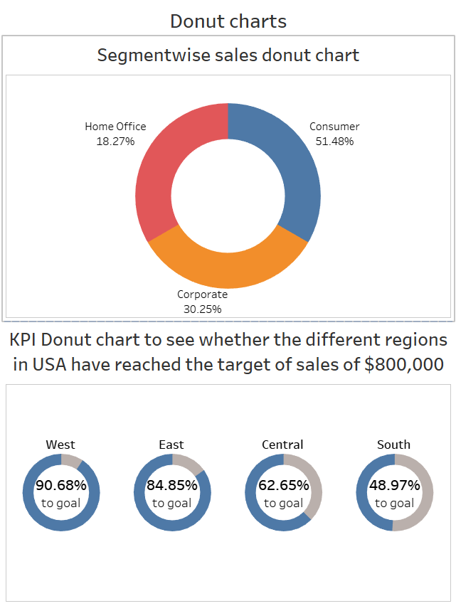
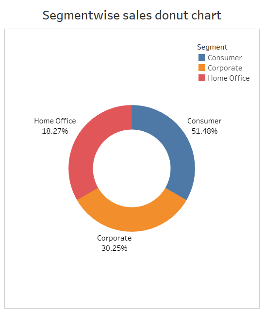
Question: Make a donut chart to show percentage of sales of different segments in global superstore.
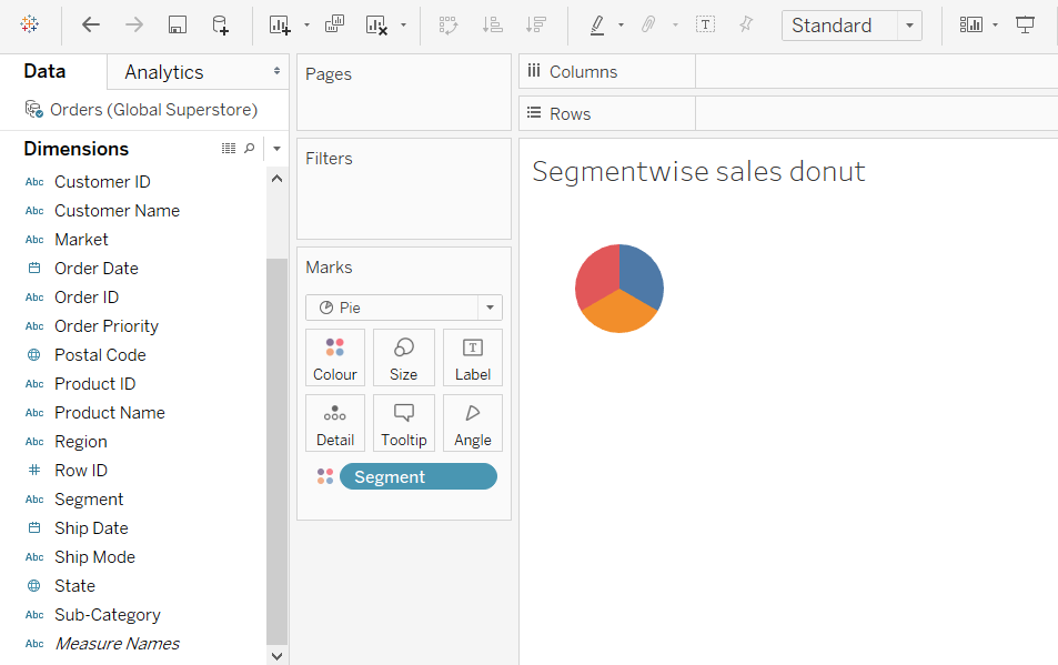
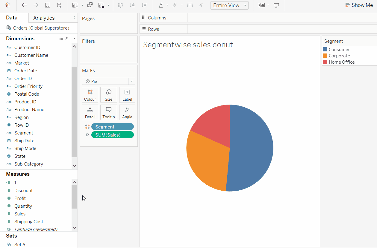
- Start by making a pie chart.
-
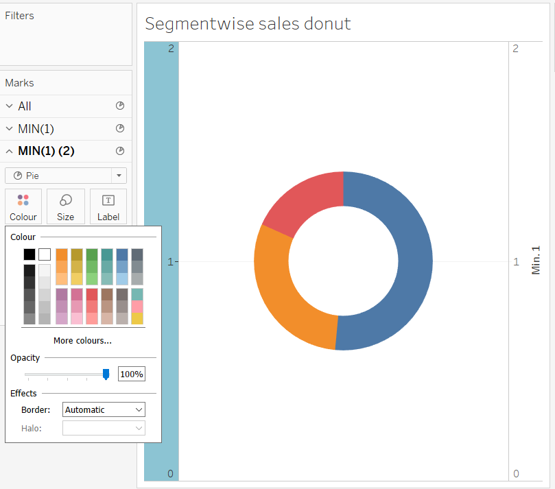
Drag Segment to the Colour in marks card and then select Pie from the dropdown menu in the marks card.
-
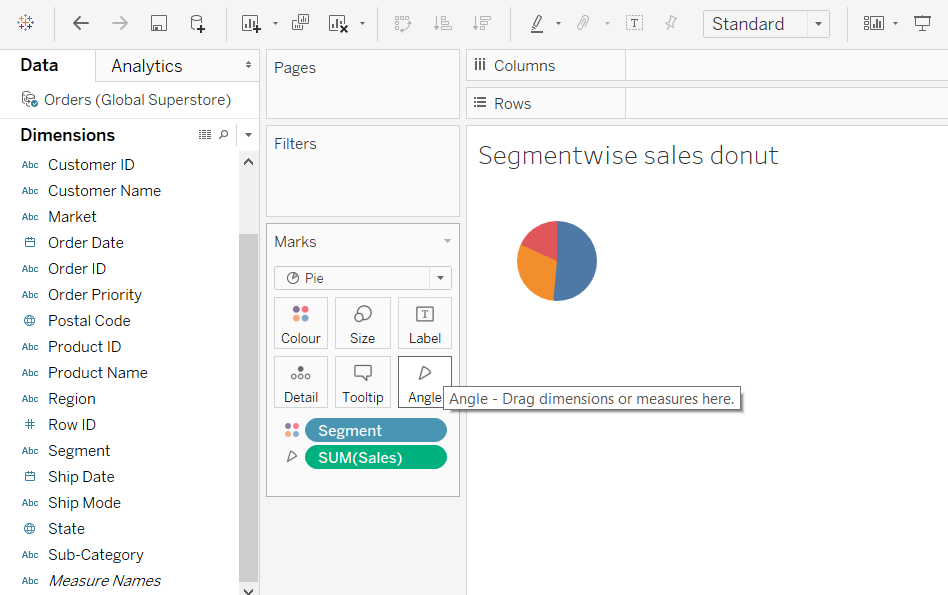
And then drag Sales to the newly appeared Angle section in the marks card.
-
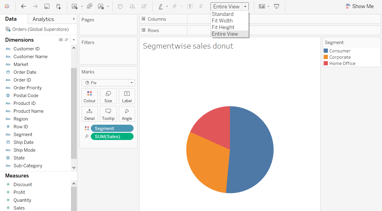
Now select Entire View in the toolbar above to increase the size of pie chart.
-
-
To create the inner circle
-
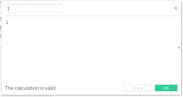
Create a calculated field named 1 and having a value
1.
-
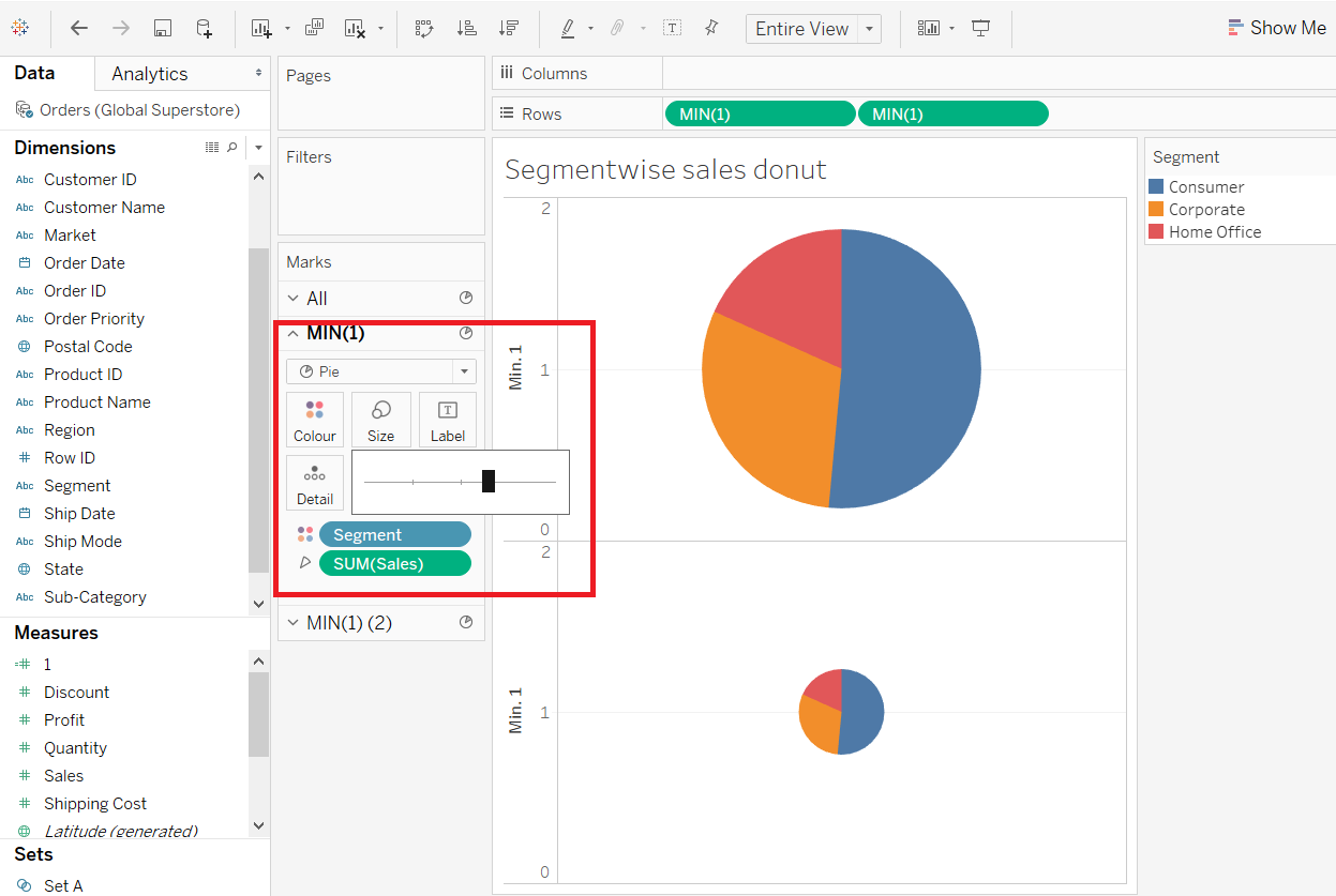
Drag the newly created field 1 to the Rows shelf and change the measure from sum() to min(). Then create a duplicate copy of the pill MIN(1)
-
Increase the size of the first pie chart by increasing the size parameter in the marks card of the upper circle.
-
Now the lower pie chart must be converted to a circle so remove the dimension segment from the color section of marks card of lower circle.
-
-
Overlaying the pie chart and the inner circle
-
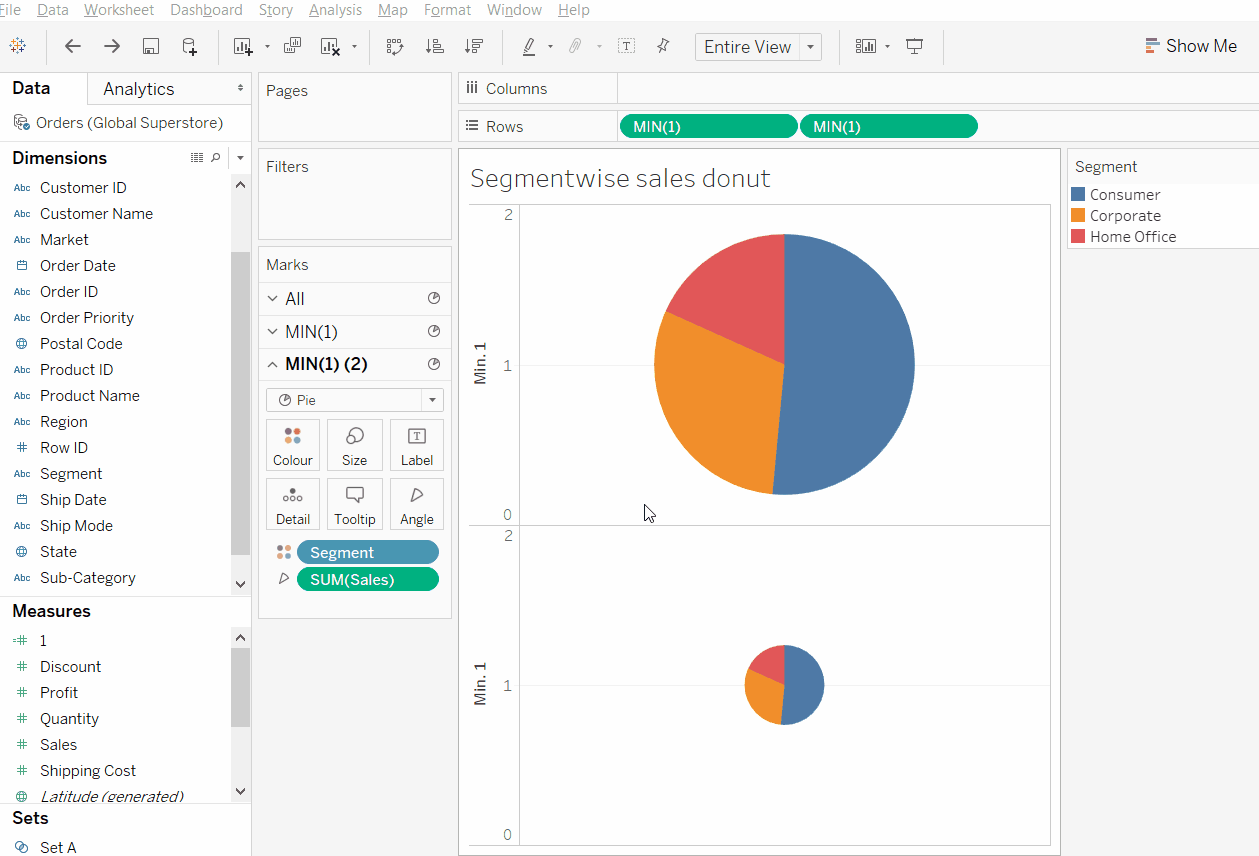
Now in the marks card section for the lower circle remove the angle SUM(Sales) pill and convert the axes to dual axis so that the upper and lower circles overlap. Then increase the size of the lower circle so that the overall figure represents a donut.
-
Now change the color of the inner circle to white.
- Now format and remove the lines, axis and headers from the sheet.
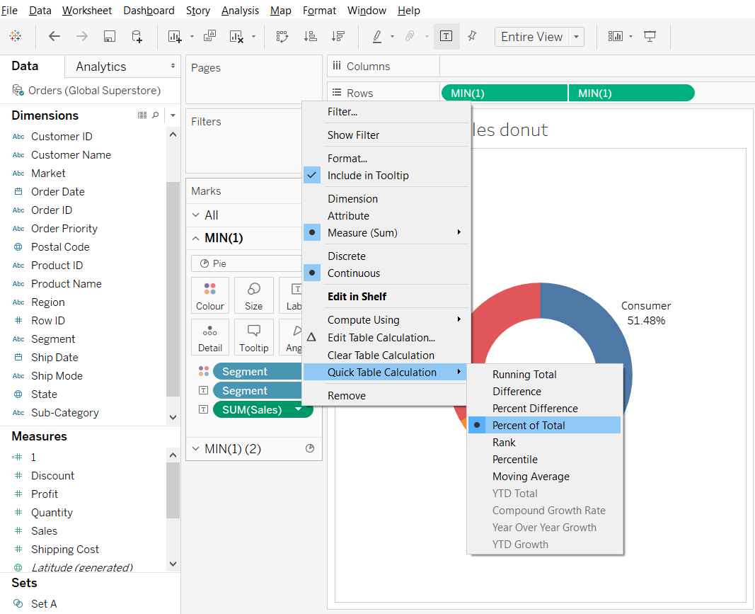
- Now hold ctrl and drag the pills of Segment and SUM(Sales) to the labels’ mark card of the upper circle. And do a quick table calculation to get the percentage of sales of the segments involved.
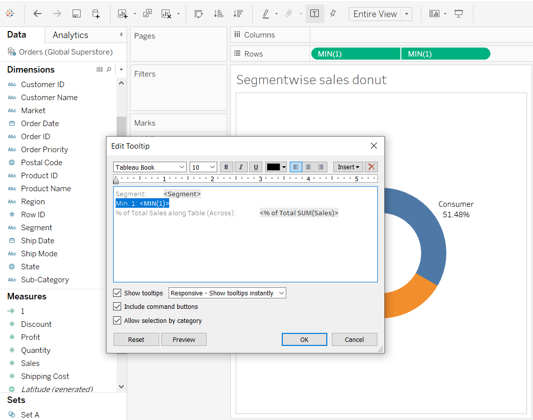
- Now adjust the tooltip of the overall donut chart to remove the MIN 1.
-
The resultant donut chart -
Type 2: KPI Donut chart
The best use of donut chart is to show KPIs, according to Ryan Sleeper:
When used for the specific purpose of showing a metric’s progress to goal, with one “slice” being the current state of the KPI and one “slice” being the remainder to goal, I think a donut chart works well.
A disadvantage of using KPI Donut chart is that it takes up lot of space in the dashboard so the Bullet graph is better alternative.
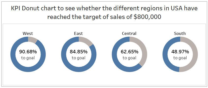
Question: Make a KPI Donut chart to see whether the different regions in USA have reached the target of sales of $800,000.
-
As the dataset has data of only United States, this can be done by filtering using context filter.
-
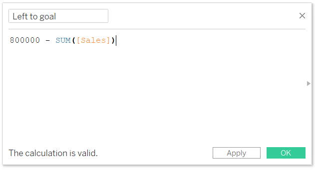
As the global superstore dataset does not have a goal or target specified so here I will hardcode a target of $800,000 for each region in the US. And create a calulated field Left to goal:
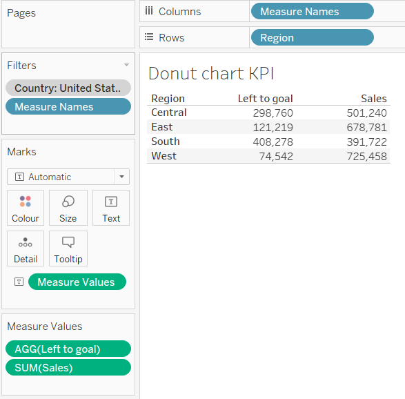
So, the resulting data we will be plotting using KPI Donut chart.
-
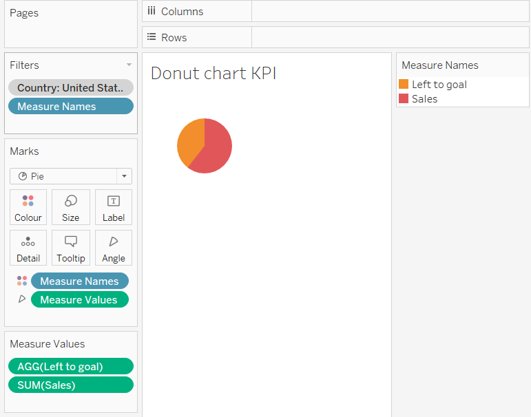
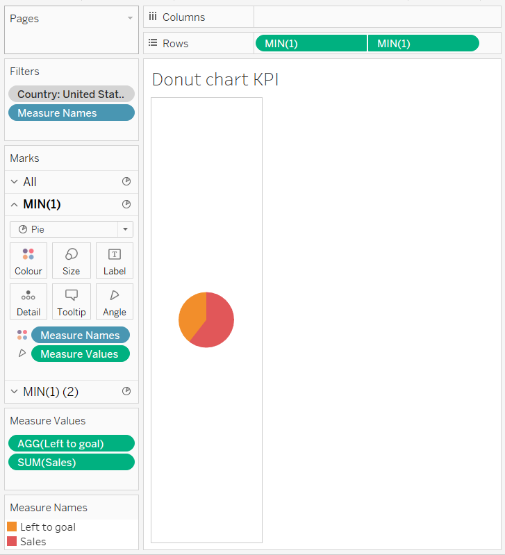
Now to create a pie chart using two measures: Sales and the newly created Left to goal. Select pie chart in the dropdown of marks card and drag Measure Name dimension to the Colour Marks card and Measure Values to the Angle marks card. Then filter the view on Measure Names to only include Sales and Left to goal.
-
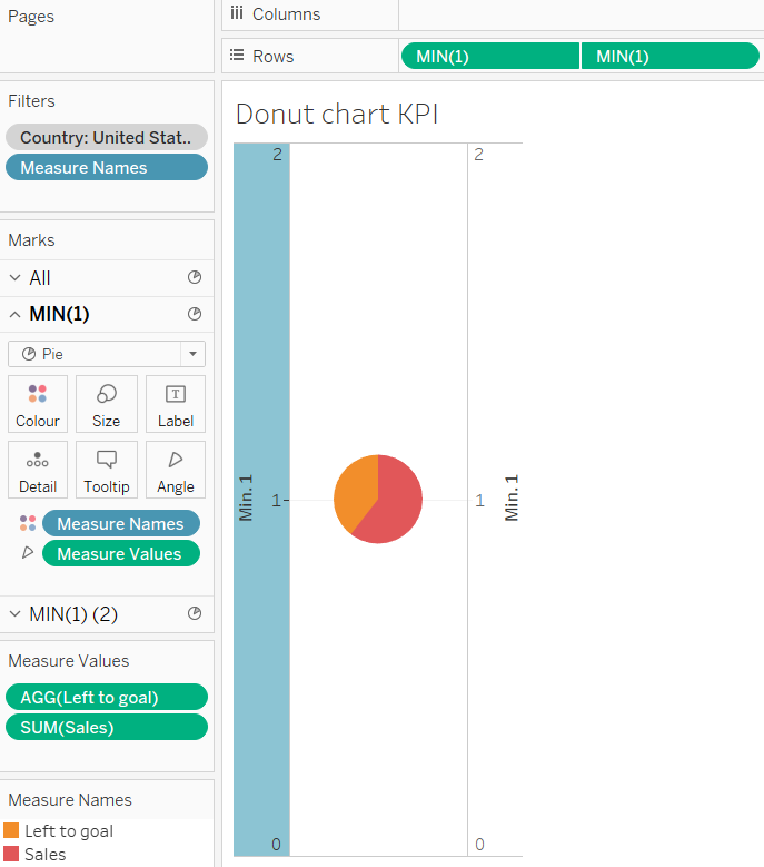
Drag the calculated field 1 measure to the Rows shelf and change the aggregation to minimum. Duplicate the pill MIN(1) on the rows shelf and then right-click on the second pill and choose “Dual Axis”. Then synchronize the axes.
-
Format the sheet to remove axes, headers and zero line.
-
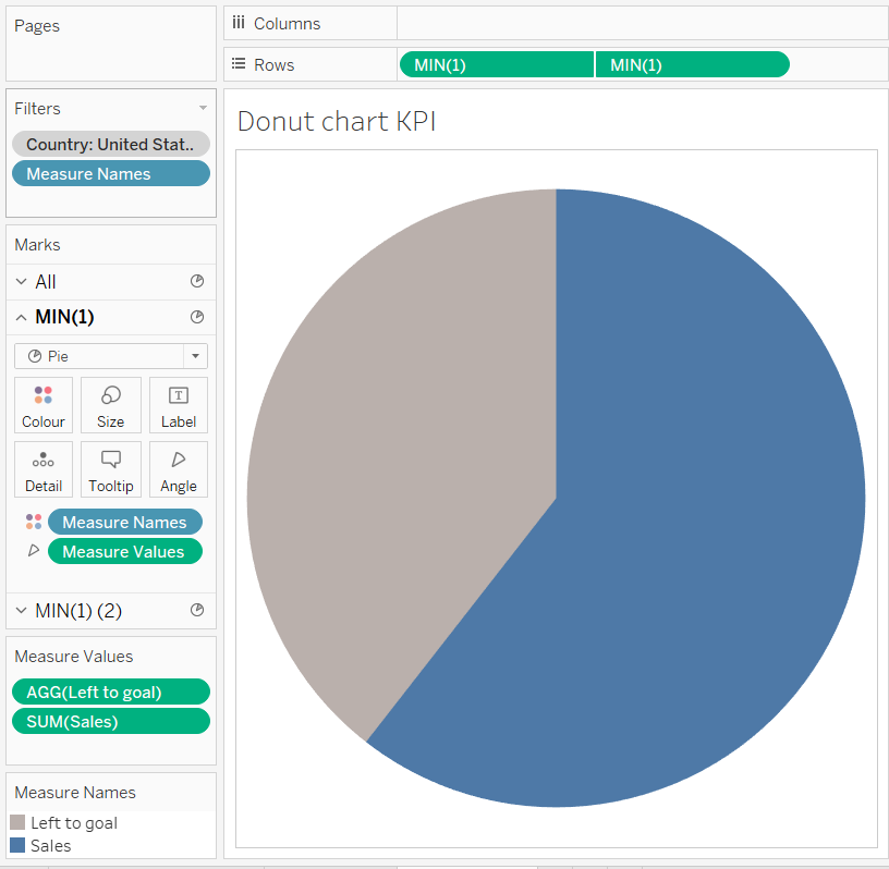
Format the primary axis to increase the size of the pie chart, adding a border and most importantly: coloring the Sales measure to a color of your choice (say, blue) and the Left to goal to measure grey. This will eventually create the filling gauge effect in KPI we are going for.
-
Now to create a hole in the pie chart formed above use secondary axis. Remove Measure Name and Measure axis and change its color to white.
-
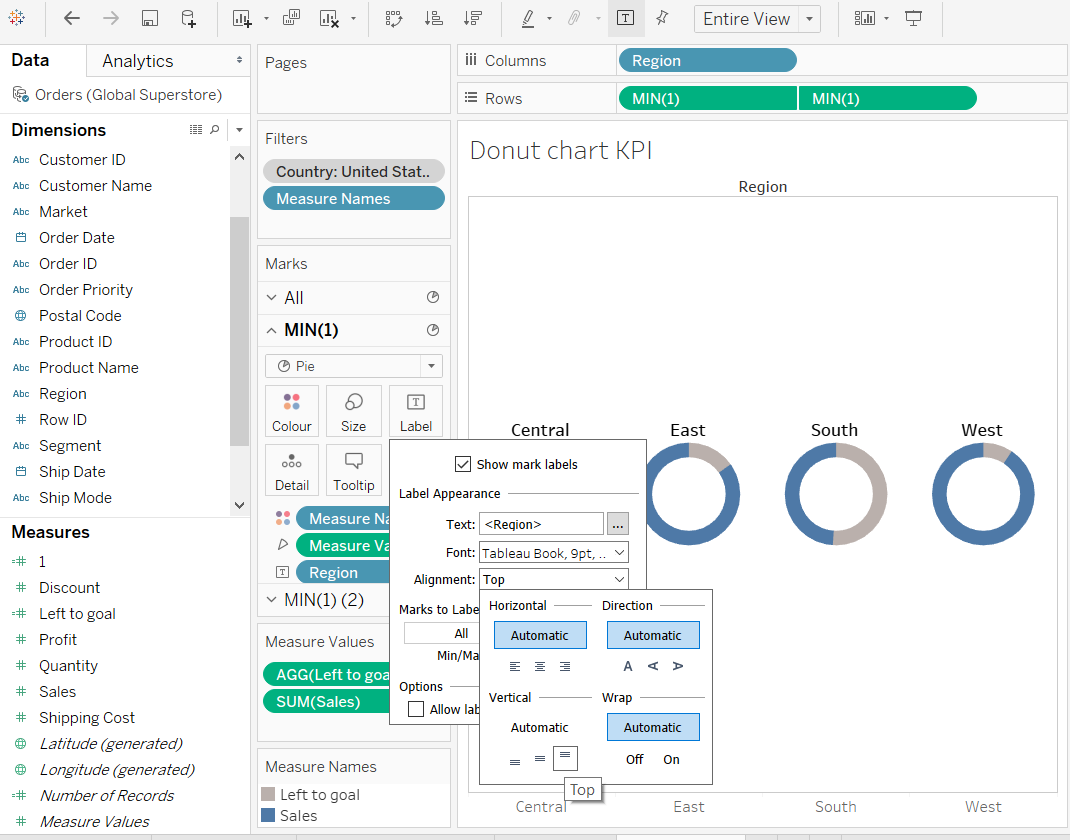
Now add dimension Region to the columns shelf and drag it to the labels of the primary axis and set its alignment to top and make the labels as bold.
-
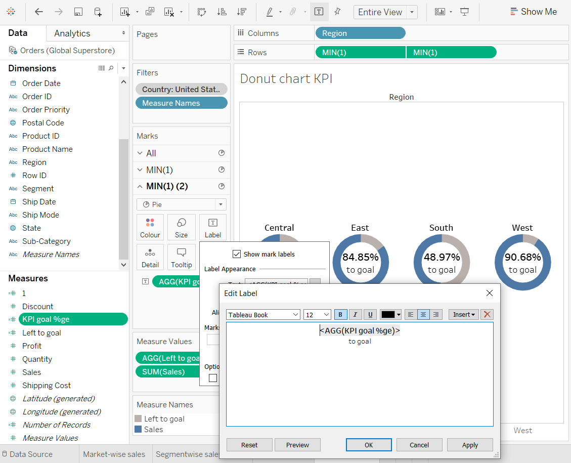
Create a calculated field named KPI goal %ge to find the percentage of sales target achieved and then format it to percentage and to 2 decimal places. And then modify the label in the secondary axis to show the KPI
-
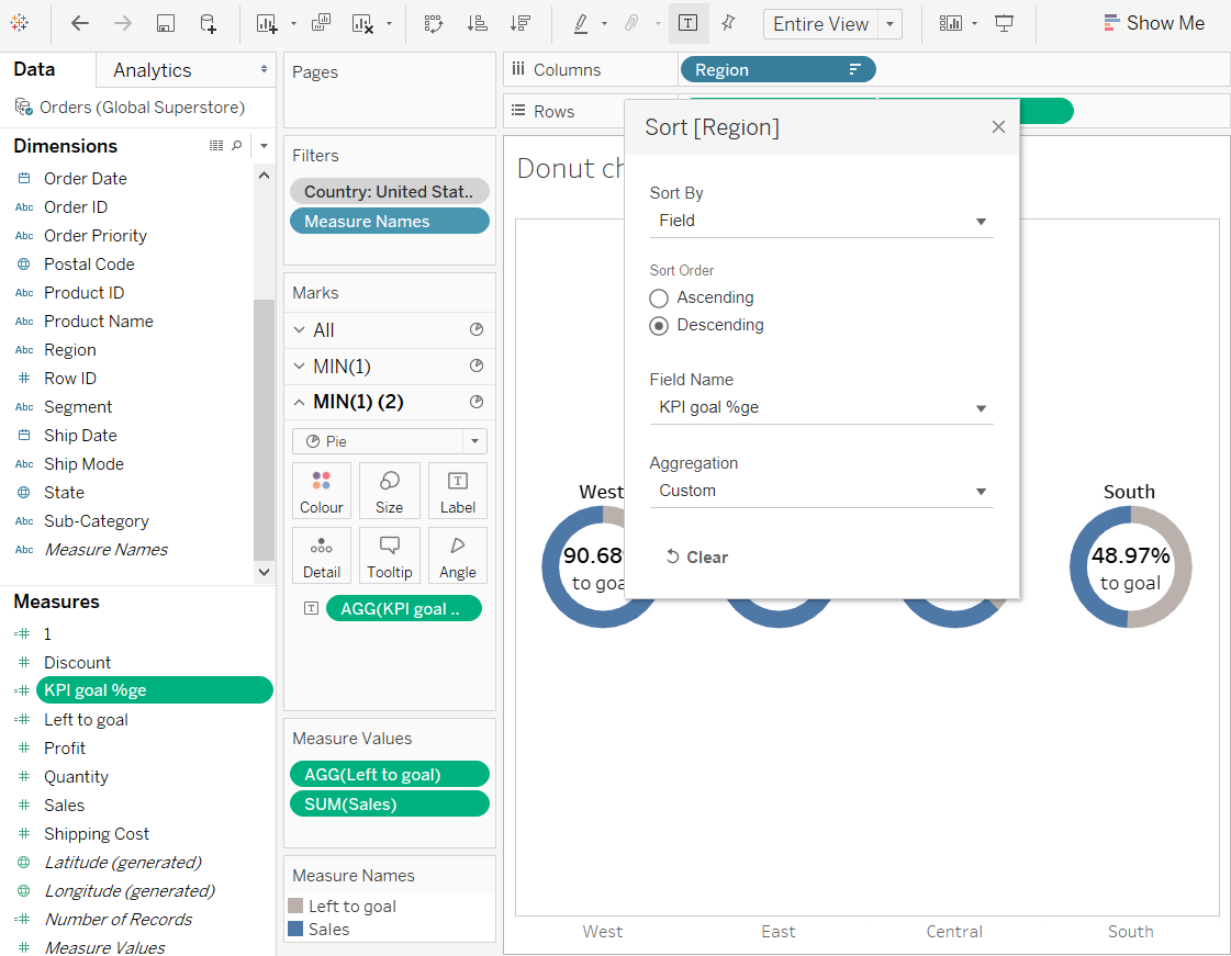
Sort Region in the column shelves by the % to goal metric in descending order.
-
Resultant KPI donut chart.
Click here to see the resultant donut charts dashboard