JESWIN GEORGE

DATA ANALYST
Download my resume
View My LinkedIn Profile
View My Tableau Public Profile
Pareto Chart
A Pareto Chart is a dual-axis combination chart used to highlight dimension members that are having the biggest impact to the measure in question. On the primary axis, bars are used to show the raw quantities (of measure) for each dimension member, sorted in descending order. On the secondary axis, a line graph is used to show the cumulative total of measure(or in the percent format).
It is basically based on the theory of 80-20 phenomena, where it means that 80% of the output is being generated by the 20% of the input.
Application
- In quality control, it often represents the most common sources of defects, the highest occurring type of defect, or the most frequent reasons for customer complaints.
- In terms of retail data, we can also say like this that 80% of revenue is from 20% of customers/products.
Steps to make chart
Click here to download the Global superstore orders Data used here
Load the Orders data to Tableau.
-
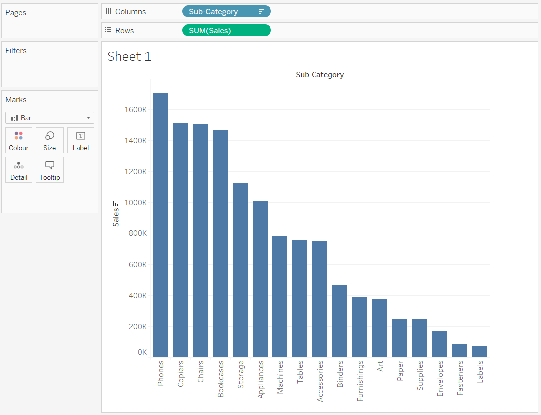
Drag the Sub-category on the columns shelf and Sales on the y-axis and then arrange the Sub-Category in descending order.
-
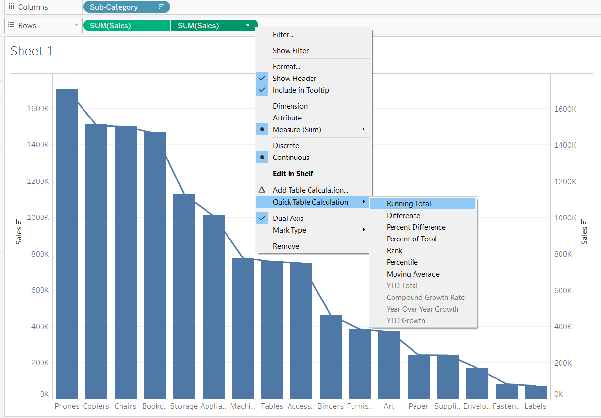
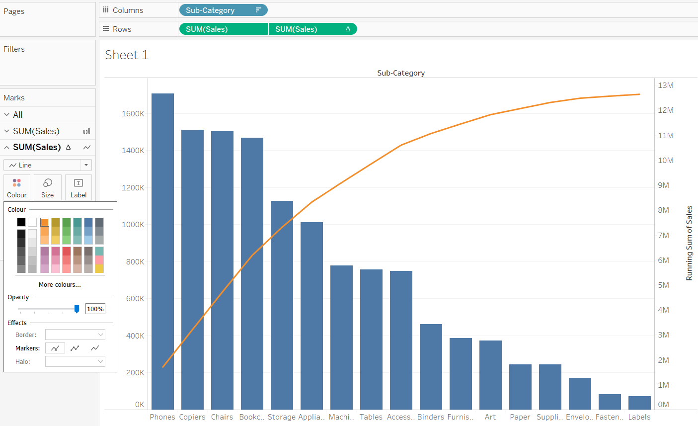
Next, hold ctrl and create copy of pill
SUM(Sales)in the Rows shelf itself. Then right click on the 2nd newly formedSUM(Sales)and create a dual axis. Then change the Mark Type of the second chart to Line: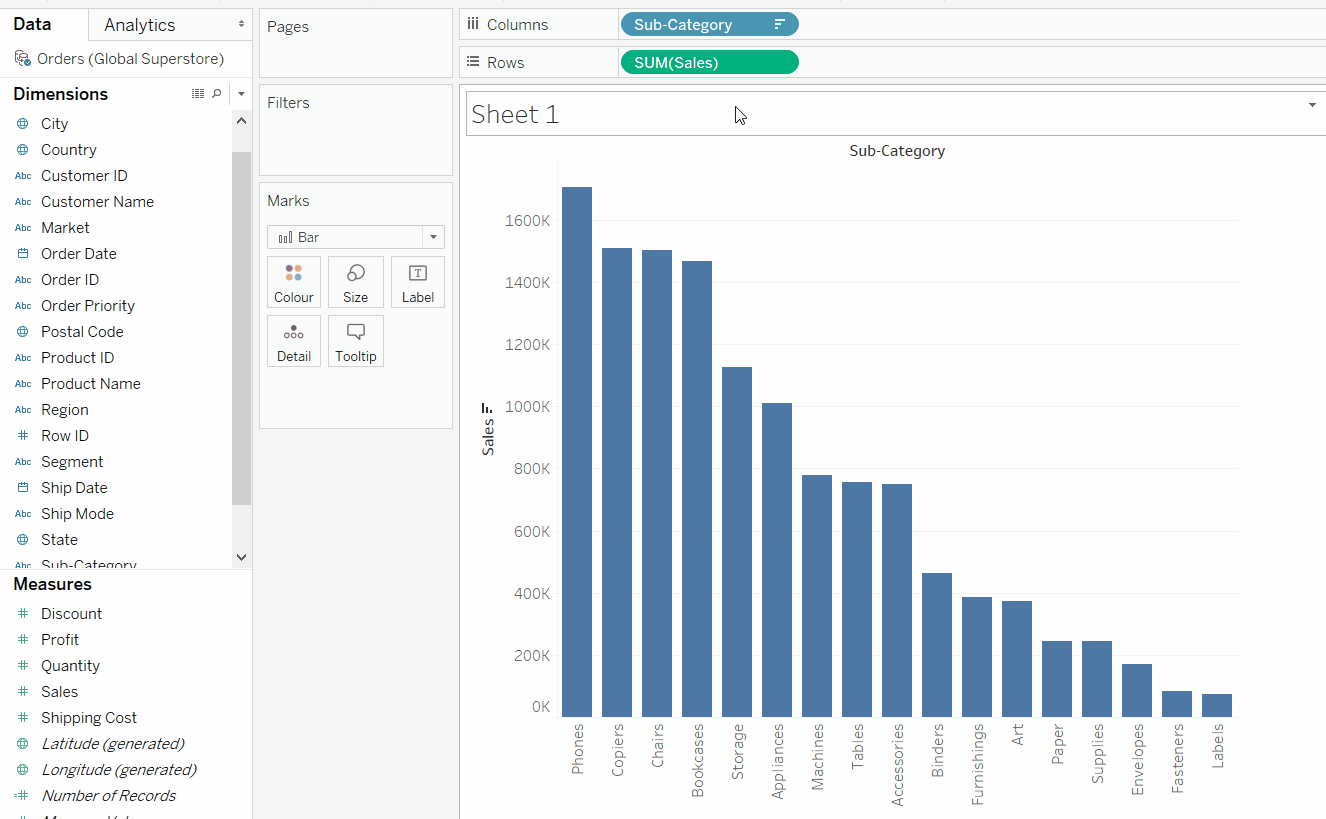
-
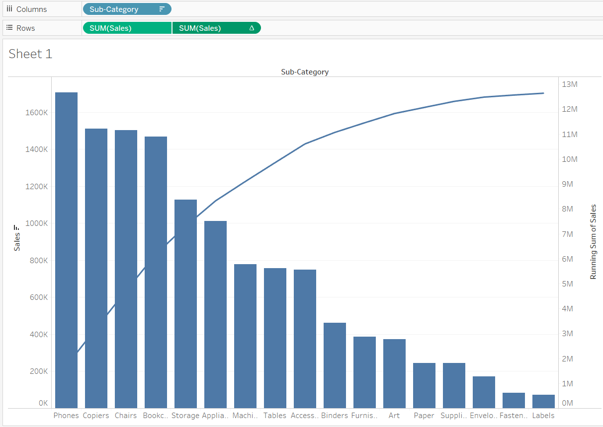
Now to get the cumulative total on the right (secondary) axis do a quick table calculation of running_total.
-
The resulatant image with cumulative total on the secondary axis with the modified line chart.
-
Click on the Color marks card, to change the color of the line and the Pareto chart is completed.
-
Now to change the cumulative total on the secondary axis in terms of percentage use secondary table calculation. Right click on the second pill
SUM(Sales)and checkAdd Secondary Calculationand secondary calculation tyoe as Percent of Total.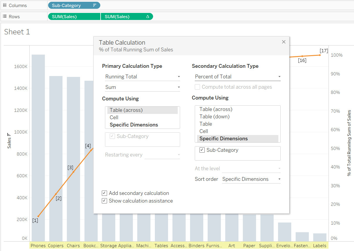
-
The resulatant image:
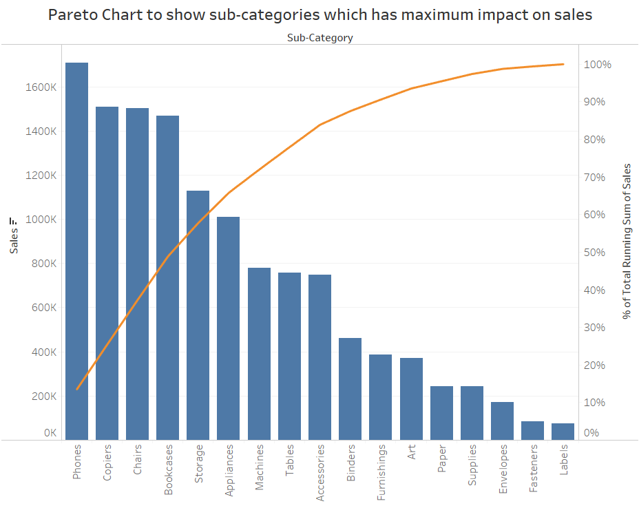
Insights obtained from the above chart - close to 60% of the sales is caused by 5 sub-categories: Phones, Copiers, Chairs, Bookcases and Storage.